When it comes to choosing colors for your living space or redoing the office, it can be difficult to know which colors to choose. Knowing that you’re going to be spending a lot of time in one particular space means you want to ensure that the colors you pick will best match your tastes.
Picking out certain colors may seem easy, but it doesn’t take long to get overwhelmed with colors and terminology. Never fear, though! There are a few techniques you can try if you find yourself having a little trouble.
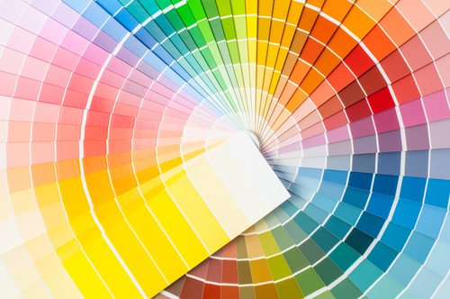
You can scroll through this piece to find out more about the color wheel at home, color schemes at home, and apps you can download to find out more about how to use color schemes in the home.

The Color Wheel At Home
- Most color wheels consist of 12 colors, though some may add a few more intermediates thereby having 24.
- There are three primary colors (red, yellow, blue).
- Secondary colors come from mixing primary colors (purple, orange, green).
- Tertiary colors come from mixing a secondary color with a primary one.
- All colors have hues, tints, and shades. Hues are solid colors, tints are when you mix a solid color with white, and a shade is when you mix a solid color with black.
- Colors are split into warm and cool colors. Warm colors offer feelings of passion, energy, and happiness. Cool colors tend to give off feelings of calmness or professionalism. Examples of warm colors would be red, orange, and yellow while examples of cool colors would be blue, green, and purple.
Now, these basics are all to help you lay the foundation for picking out a great color scheme for your space. Using primary colors in the home doesn’t have to be as childish-looking as some people might perceive it to be. Their advice is to “use only one or two bright hues at a time. When using red, yellow and blue together, keep one or two colors in the pure hues and mute down the third by choosing a color that either has a bit more black or white or leans slightly to the right or left of the color wheel.”
To figure out exactly which colors would be best for your home, you should re-familiarize yourself with the color wheel and the various ways that you can play around with it. For example, HGTV reports that warmer colors “are believed to raise blood pressure and body temperature—and ultimately make people feel warmer.” Red, orange, and yellow are all good places to start, but there are colors you can pair them with to really make your space pop. The article continues by saying, “A good rule of thumb is to select shades that are next to each other on the color wheel and pair them with a grounding neutral. It’s also helpful to balance warm tones with a cool color or two. To find complementary shades, choose ones that are opposite your favorite warm colors on the color wheel.”
For this and many other reasons, it’s important to be familiarized with the color wheel, complementary colors, and how to play around with different hues to make the most of your rooms.
When it comes to using secondary or tertiary colors in the home, it’s best to follow the 60-30-10 rule. The rule is simple to follow once you have your colors chosen: 60% of the room will be the main color (walls, area rugs), 30% is the secondary color (curtains, accent walls) and 10% is your accent color (throw pillows, artwork).
Several websites out there also give great tips regarding how to choose colors for certain spaces such as not getting overwhelmed with color options, sample the paint you’re thinking of, and learning the difference between warm and cool colors.
Now that we have the basics out of the way let’s take a closer look at the color wheel and how to pick the best combination for your space.

Color Schemes At Home
- Complementary Colors: These are the colors are opposite one another on the wheel, and we’ve written about complementary colors in greater detail if you’d like to learn more. For example, yellow and violet would be complementary. These colors, however, do pack quite the punch when mixed so use in moderation.
- Split Complementary Colors: This is a modification to the complementary scheme and it uses three colors. What happens here is that you’ll take your base color (yellow) and use the two colors adjacent to the complementary color. So, if yellow and violet are complementary, you’ll now use yellow, blue-violet, and red-violet. These colors aren’t as dramatic as purely complementary colors so they have a softer look when paired.
- Analogous Colors: These colors are basically just three colors beside each other on the color wheel. For example, orange, red-orange, and red. These colors match well because they’re so closely related and pair nicely when used together.
There are three additional schemes that are a bit more complicated but have been explained nicely by blogs and websites dedicated to color theories or decor.
- Triadic Colors: These colors are ones that are equally spaced out on the color wheel. For example, green, orange, and violet would be triadic colors. This scheme offers harmony but also a good amount of contrast, which allows the space to pop.
- Square Colors: This scheme works like the triadic scheme in that you’ll now use four colors evenly spaced on the color wheel. For example, you could use red, yellow-orange, green, and blue. For this one, you should focus more on letting one color be the dominating one and pay attention to the warm and cool colors used for an optimal use of the scheme.
- Tetradic Colors: This scheme is much like the square color theme, but instead make a rectangle on the wheel. These colors are two opposites on the color wheel and then you move two spaces next to the original two for the other two colors. You’re essentially using two pairs of complementary colors. These colors are hard to pair but if you let one dominate the others, it’ll tie the scheme together better.
There are various ways in which you can use these color schemes to get more out of your spaces at home. For example, some home sites explain that you can use analogous colors like red, red-orange and red-violet to “create a relaxing and inviting bedroom with so much ease and simplicity that it’s hard not to want to jump right into bed for an afternoon nap.” They also use the example of yellow, yellow-orange, and orange to create a look that’s retro and vibrant.
House Painting Tutorials offers great examples of how to use split complementary colors. One color set that they used was yellow, green, and violet-red in generous amounts to “really crank up the mood in the room, you can do that by using the colors in equal amounts and by increasing their saturation.” They went on to say that many people say using secondary complementary colors are good for beginners because it’s hard to muck up the color scheme.
You can also use triadic colors such as violet, orange, and green to compliment one another in a specific room. You can play with other color combinations such as red, yellow, and blue to make the most of a room.

There are a lot of apps for your phone that can make understanding color schemes easier and they can also help you choose which colors are best for your needs. Apps like Adobe Color CC, Material Palette, COLOURlovers, and Pictaculous are some good choices for you to introduce these color schemes into your life.
Now that you have an understanding of the basics, feel free to introduce these schemes into your life! Don’t focus on just redoing your living space or offices either. There are a lot of ways that you can play with the color wheel and with the basics down, you’ve got a lot of possibilities at your disposal.